html
<aparte-chat-viewport style="height: 39rem"></aparte-chat-viewport>

<script>
  // In an app: import { setupItemsCard } from '@aparte/plugin-cards/items';
  const { setupItemsCard } = window.apartePlugins.cards.items;

  // A card shows only http(s) pictures: these are served by this site, which its image
  // policy lets load. Without it they wait behind "Show images", as any picture would.
  window.aparte.aparteGlobalConfig.setImagePolicy(['self']);
  const picture = (name) => new URL('/demo-pictures/' + name + '.svg', location.href).href;

  setupItemsCard({ tool: 'search_recipes' });

  const viewport = document.querySelector('aparte-chat-viewport');
  viewport.appendMessage({ id: 'u1', role: 'user', content: 'Some quick dinner ideas for this week?', timestamp: Date.now() });
  viewport.appendMessage({ id: 'a1', role: 'assistant', timestamp: Date.now(), segments: [{
    id: 's1', type: 'tool_call', status: 'resolved',
    toolCall: { id: 'c-s1', name: 'search_recipes', input: { query: 'quick autumn dinners' } },
    structuredResult: {
      title: 'Autumn dinners under 40 minutes',
      items: [
        { title: 'Roast tomato soup with basil', subtitle: 'Weeknight kitchen', image: picture('dish-tomato'), badge: '35 min',
          description: 'Tomatoes, garlic and onion roasted until sweet, blended with stock, finished with basil oil.',
          meta: ['4 servings', 'Vegetarian'], url: 'https://recipes.example.org/roast-tomato-soup' },
        { title: 'Butternut risotto with sage', subtitle: 'Weeknight kitchen', image: picture('dish-squash'), badge: '40 min',
          description: 'Half the squash roasted, half stirred in until it melts; crisp sage leaves on top.',
          meta: ['2 servings', 'Vegetarian'], url: 'https://recipes.example.org/butternut-risotto' },
        { title: 'Pear, walnut and bitter leaf salad', subtitle: 'Market greens', image: picture('dish-greens'), badge: '15 min',
          description: 'Chicory and rocket with sliced pear, toasted walnuts and a mustard dressing.',
          meta: ['2 servings', 'Vegan'], url: 'https://recipes.example.org/pear-walnut-salad' },
        { title: 'Blackberry almond tart', subtitle: 'Weekend baking', image: picture('dish-berries'), badge: '40 min',
          description: 'A press-in almond crust, a thin layer of frangipane and the last blackberries of the year.',
          meta: ['8 slices'], url: 'https://recipes.example.org/blackberry-almond-tart' },
      ],
    },
  }] });
</script>
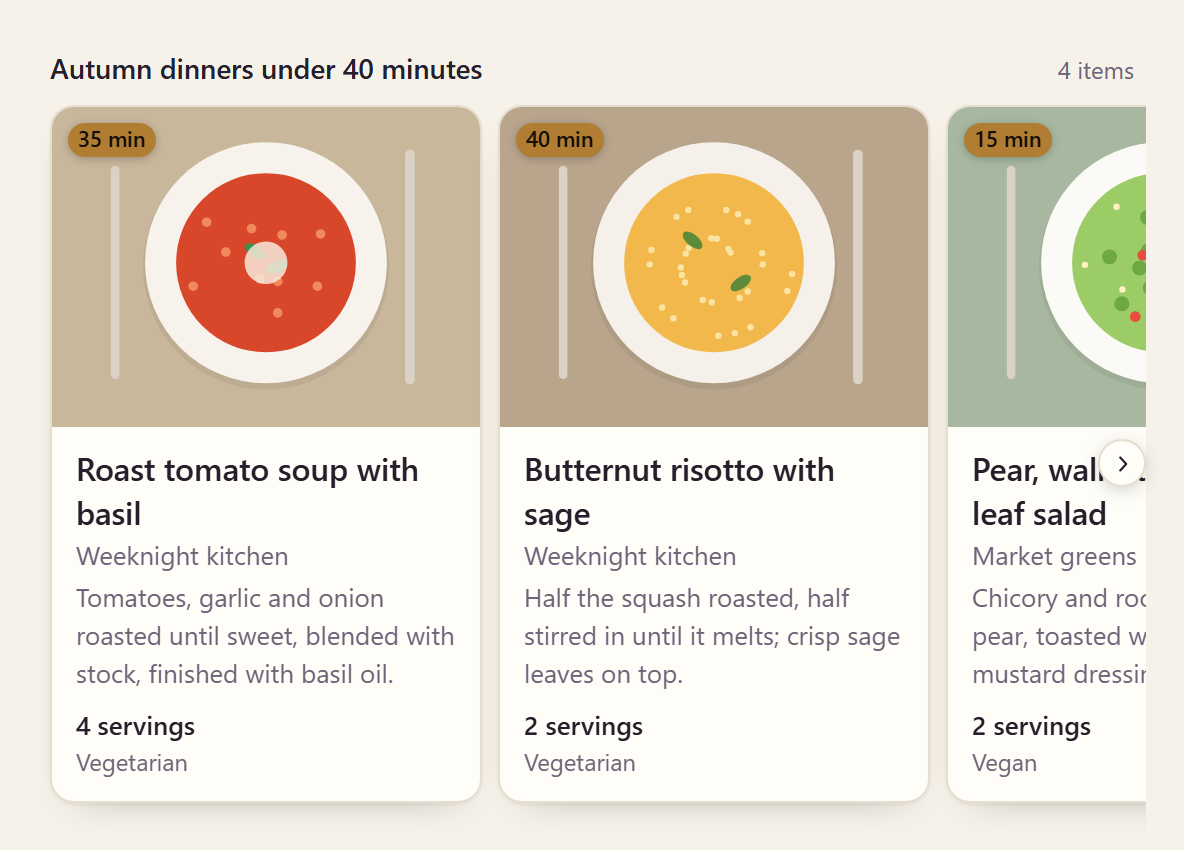
The generic card: one item or up to ten, each a title with a picture, a badge over its corner, a
few lines of detail and up to three short facts. The whole tile opens its url in a new tab. One
item, in any variant, is one card at full width.
Variants
Section titled “Variants”html
<aparte-chat-bubble message-id="a1" data-role="assistant" name="Assistant"></aparte-chat-bubble>

<script>
  // In an app: import { setupItemsCard } from '@aparte/plugin-cards/items';
  const { setupItemsCard } = window.apartePlugins.cards.items;

  // A card shows only http(s) pictures: these are served by this site, which its image
  // policy lets load. Without it they wait behind "Show images", as any picture would.
  window.aparte.aparteGlobalConfig.setImagePolicy(['self']);
  const picture = (name) => new URL('/demo-pictures/' + name + '.svg', location.href).href;

  setupItemsCard({ tool: 'search_recipes', variant: 'list' });

  document.querySelector('aparte-chat-bubble').setSegments([{
    id: 's1', type: 'tool_call', status: 'resolved',
    toolCall: { id: 'c-s1', name: 'search_recipes', input: { query: 'quick autumn dinners' } },
    structuredResult: {
      title: 'Autumn dinners under 40 minutes',
      items: [
        { title: 'Roast tomato soup with basil', subtitle: 'Weeknight kitchen', image: picture('dish-tomato'), badge: '35 min',
          description: 'Tomatoes, garlic and onion roasted until sweet, blended with stock, finished with basil oil.',
          meta: ['4 servings', 'Vegetarian'], url: 'https://recipes.example.org/roast-tomato-soup' },
        { title: 'Butternut risotto with sage', subtitle: 'Weeknight kitchen', image: picture('dish-squash'), badge: '40 min',
          description: 'Half the squash roasted, half stirred in until it melts; crisp sage leaves on top.',
          meta: ['2 servings', 'Vegetarian'], url: 'https://recipes.example.org/butternut-risotto' },
        { title: 'Pear, walnut and bitter leaf salad', subtitle: 'Market greens', image: picture('dish-greens'), badge: '15 min',
          description: 'Chicory and rocket with sliced pear, toasted walnuts and a mustard dressing.',
          meta: ['2 servings', 'Vegan'], url: 'https://recipes.example.org/pear-walnut-salad' },
        { title: 'Blackberry almond tart', subtitle: 'Weekend baking', image: picture('dish-berries'), badge: '40 min',
          description: 'A press-in almond crust, a thin layer of frangipane and the last blackberries of the year.',
          meta: ['8 slices'], url: 'https://recipes.example.org/blackberry-almond-tart' },
      ],
    },
  }]);
</script>
Rows, a thumbnail at the start: for results a person scans rather than browses.
html
<aparte-chat-bubble message-id="a1" data-role="assistant" name="Assistant"></aparte-chat-bubble>

<script>
  // In an app: import { setupItemsCard } from '@aparte/plugin-cards/items';
  const { setupItemsCard } = window.apartePlugins.cards.items;

  // A card shows only http(s) pictures: these are served by this site, which its image
  // policy lets load. Without it they wait behind "Show images", as any picture would.
  window.aparte.aparteGlobalConfig.setImagePolicy(['self']);
  const picture = (name) => new URL('/demo-pictures/' + name + '.svg', location.href).href;

  setupItemsCard({ tool: 'search_recipes', variant: 'grid' });

  document.querySelector('aparte-chat-bubble').setSegments([{
    id: 's1', type: 'tool_call', status: 'resolved',
    toolCall: { id: 'c-s1', name: 'search_recipes', input: { query: 'quick autumn dinners' } },
    structuredResult: {
      title: 'Autumn dinners under 40 minutes',
      items: [
        { title: 'Roast tomato soup with basil', subtitle: 'Weeknight kitchen', image: picture('dish-tomato'), badge: '35 min',
          description: 'Tomatoes, garlic and onion roasted until sweet, blended with stock, finished with basil oil.',
          meta: ['4 servings', 'Vegetarian'], url: 'https://recipes.example.org/roast-tomato-soup' },
        { title: 'Butternut risotto with sage', subtitle: 'Weeknight kitchen', image: picture('dish-squash'), badge: '40 min',
          description: 'Half the squash roasted, half stirred in until it melts; crisp sage leaves on top.',
          meta: ['2 servings', 'Vegetarian'], url: 'https://recipes.example.org/butternut-risotto' },
        { title: 'Pear, walnut and bitter leaf salad', subtitle: 'Market greens', image: picture('dish-greens'), badge: '15 min',
          description: 'Chicory and rocket with sliced pear, toasted walnuts and a mustard dressing.',
          meta: ['2 servings', 'Vegan'], url: 'https://recipes.example.org/pear-walnut-salad' },
        { title: 'Blackberry almond tart', subtitle: 'Weekend baking', image: picture('dish-berries'), badge: '40 min',
          description: 'A press-in almond crust, a thin layer of frangipane and the last blackberries of the year.',
          meta: ['8 slices'], url: 'https://recipes.example.org/blackberry-almond-tart' },
      ],
    },
  }]);
</script>
Two columns of tiles.
While the call runs
Section titled “While the call runs”html
<aparte-chat-bubble message-id="a1" data-role="assistant" name="Assistant"></aparte-chat-bubble>

<script>
  // In an app: import { setupItemsCard } from '@aparte/plugin-cards/items';
  const { setupItemsCard } = window.apartePlugins.cards.items;

  setupItemsCard({ tool: 'search_recipes' });

  // The call is still running: the card draws its skeleton, with what the input already says.
  document.querySelector('aparte-chat-bubble').setSegments([{
    id: 's1', type: 'tool_call', status: 'pending',
    toolCall: { id: 'c-s1', name: 'search_recipes', input: { query: 'quick autumn dinners' } },
  }]);
</script>
The skeleton keeps the place of the tiles, under what the search was for.
bash
npm install @aparte/plugin-cards @aparte/corets
import { setupItemsCard } from '@aparte/plugin-cards/items';

setupItemsCard({
  tool: 'search_recipes',
  map: (result) => ({
    title: result.heading,
    items: result.hits.map((hit: { name: string; site: string; photo: string; link: string }) => ({
      title: hit.name,
      subtitle: hit.site,
      image: hit.photo,
      url: hit.link,
    })),
  }),
});
An item’s fields, and its buttons (an id your app answers, never a message sent from a tool’s
result), are in the guide.
Related
Section titled “Related”- Link card — a web page previewed, with its site.
- Product card — when the items have a price.